How Personalization Can Reduce Ecommerce Bounce Rates by 20-30%
Every day, an ecommerce store dies at the hands of a high bounce rate.
Because, if consumers are leaving, they ultimately aren’t buying.
And if consumers were buying their product, ecommerce stores wouldn’t die.
After all, the whole goal of an ecommerce store is to sell items online. If that’s not happening, despite your pretty website, brand name, and lead-generating ads, you don’t have much of an ecommerce store.
But we have to go deeper.
Why are people leaving your website without making a purchase? What is causing a high bounce rate or cart abandonment and how can it be fixed?
Here are five ways you can personalise the experience to reduce bounces and reclaim sales.
What is a Bounce Rate on an Ecommerce Website?
Bounce rate is the percentage of people who leave your website after visiting only a single page. Here are some scenarios that count as a bounce on your website:
Someone clicks the back button after viewing a single page.
Someone exits their browser after viewing a single page.
A user clicks to another website that takes them elsewhere after viewing only a single page on your site
Current data puts the average bounce rate of ecommerce stores at 45.68%.
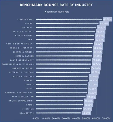
There are two primary reasons that bounces hurt ecommerce stores.
First and most detrimental, a bounce means that someone didn’t make a purchase. They left before you convinced them to buy. They visited just one page before running for the hills.
And second, the higher the percentage of visitors who bounce on your website, the worse your rankings are. When people leave after viewing only a single page, Google takes note and demotes your domain authority.
That’s a one-two punch that can kill practically any ecommerce store.
To determine your bounce rate, you can use this formula:
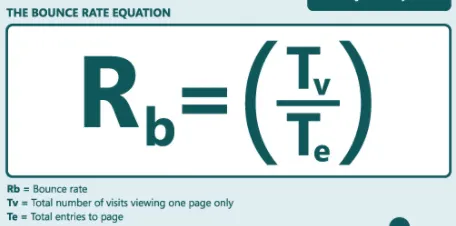
Grab the number of single-page visits to your website and divide by the number of total visits.
What’s a reasonable ecommerce bounce rate benchmark for your website, you ask?
Well, according to the latest data, somewhere between 30% and 55% is acceptable.
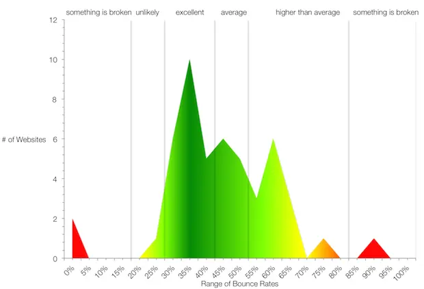
But, in reality, an acceptable bounce rate depends heavily upon what kind of page people are landing on.
Now that you are familiar with bounce rate, how to measure it, and why it harms your website, we need to discuss one more thing.
Call it a hiccup in the bounce rate equation.
This bounce rate equation doesn’t tell the whole story.
Measuring your bounce rate is important for any website, but measuring it correctly is more important.
Consider this, for example.
Someone lands on your product page from a Google search. They browse the reviews of the product, the price, the quality, and the specs.
Heck, they probably even have four or five other tabs open with different ecommerce stores sporting similar products.
In other words, they’re comparison shopping.
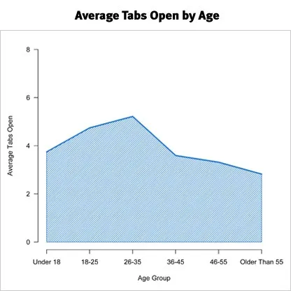
But despite their indecision, they’re interacting with your brand and considering your product carefully.
They spend a total of four minutes on your product page.
In the end, they decide not to purchase and click out of your website.
Unfortunately, they still count as a bounce.
A true bounce is when people arrive on your website and leave — usually within seconds.
Which means that they felt they were in the wrong place.
The “true bounce” is what we’re discussing in this article.
We’re talking about people who come and go quickly on a single page, whether it’s because they’re comparison shopping or not.
It’s also worth mentioning that your site-wide bounce rate won’t be very helpful for your analytics, especially if you have a lot of different types of pages on your website.
What’s more useful is your page-level bounce rate that takes into account the type of content on each page.
Blog posts almost always see higher bounce rates than your product pages. That’s normal. (It also depends on the type and quality of your content.)
But however you measure your bounce rate, if you don’t get it under control, you’ll keep losing sales like a bag of water with holes in it.
Now we’ll discuss exactly what you can do to improve your bounce rate, save sales, and build customer relationships.
Your online store depends on people who buys your product. Here are five ways to give your website the best chance of converting finicky prospects.
1. Optimise your product pages.
The product page is one of your most important assets.
It’s the final barrier between a prospect and a customer.
Prospects browse through reviews and specs, making a decision that marketers often play far too little of a part in.
Consider this product page from Pura Vida Bracelets.
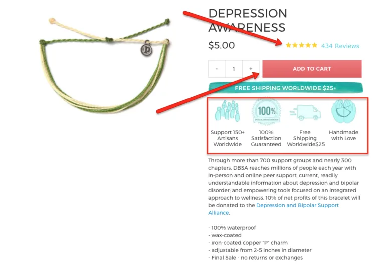
Pura Vida does a nice job of putting their review section front and centre.
They also make the “add to cart” button stand out because it’s the only thing on the page that’s coloured red.
And finally, they use icons and short descriptions to emphasise the quality and consistency of their product.
But does the colour of their button really make a difference?
ConversionXL did a study where they found that the colour of a button makes little difference on its own.
But when compared with the rest of the design of the website, it can make a difference.
When it comes to displaying reviews on your product page, some marketers hide the review section of their products in fear that bad reviews will discourage prospects from making a purchase.
But the reality is far more promising.
First, so long as your product is something you can be proud of, people won’t leave many negative reviews.
And second, reviews on a website increase conversions by an average of 20%.
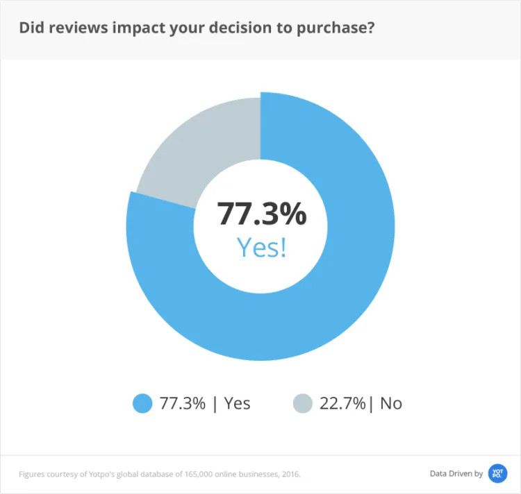
Finally, 77.3% of consumers said that reviews impacted their purchasing decision.
Often, it’s the product page on your website that makes or breaks the sale.
If you want to lower your bounce rate, then you need to keep your product page clean, include reviews, post an obvious CTA, and write compelling copy.
In the end, you should probably spend more time on your product pages than you do almost any other part of the website.
2. Segment your email list.
The more segmented your list of prospects, the more personalised the buying experience will be.
List segmentation is when you group prospects based on their behaviour with your website, emails, and products.
Then, you send them offers that are in line with their interests.
In other words, each prospect receives what feels like personal recommendations.
Keep in mind, the concept of personalisation doesn’t just apply to email lists, it also applies to website copy, live chat and messaging, and even customer service software.
Personalising through list segmentation makes a huge difference.
Consider these list segmentation results mentioned by B2C Community, where 39% of respondents said that segmentation increased their open rate.
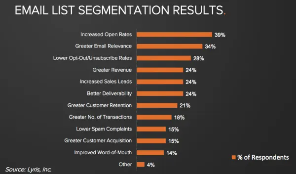
In practically every regard, email segmentation gives you a better ROI.
But why? Why are people less likely to bounce on your website with a segmented email list?
Because you’re only sending emails that are relevant, and thus interesting, to them.
Each person receives emails that they actually care about. No more spam and random offers.
And the more segmented you make your email list, the better.
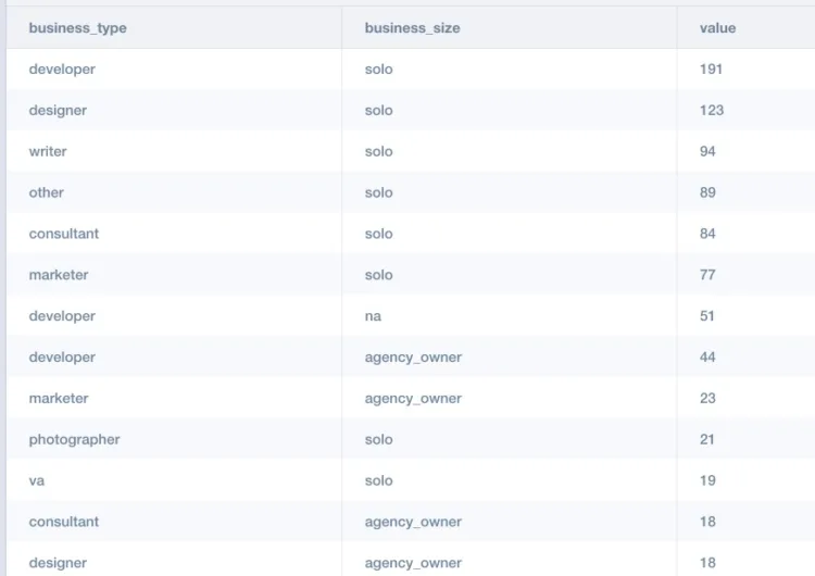
Brennan Dunn starts by segmenting his email list by profession.
This way, he can determine which product or service will be most appropriate to send each group.
And while a lot of marketers would stop there, Brennan doesn’t.
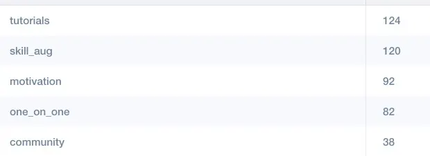
He takes it one more step and also segments his list by what type of content each group of people is most interested in receiving.
If you treat all of your prospects the same, your bounce rate will only increase.
But if you segment your list and treat each person like a person, your conversion and engagement rate will surge instead.
Your website is only half the equation. The specific visitors and sources of traffic is the other half you need to align.
3. Make the purchase experience smooth.
No one wants to get confused when they’re trying to buy a product from your website.
If visitors can’t find the correct CTA or reviews or price, that’s motivation for them to leave.
11% of cart abandoners leave because the checkout process was too complicated.
That’s a group of sales that you don’t need to lose.
Generally speaking, the more hidden you make necessary components of the buying process, the quicker people will leave your website and buy from competitors.
Banana Republic takes the clarity of the buying experience very seriously. They go so far as to explain exactly what just happened when a prospect clicks “add to cart.”
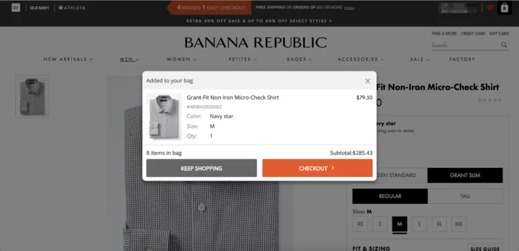
You don’t want to lose a sale due to a lack of clarity on your website or your website loads too slow because of a high time to first byte.
So err on the side of clarity, even if you think you’re being overly obvious.
Some people need the extra explanation, and the people who don’t usually won’t mind.
But sometimes it’s not your website that needs the clarification.
There’s a common mistake that ecommerce stores make with the links on their ads: they use a product page advertisement to send users to the homepage of the website.
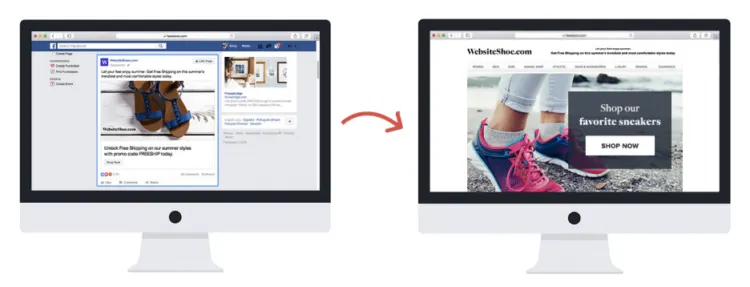
That’s a massive mistake.
People click on the ad because they’re interested in the product you’re advertising, not because they want to browse your website.
Chances are, if you send them to your homepage, they’ll just leave.
Instead, send product ads to the corresponding product page.
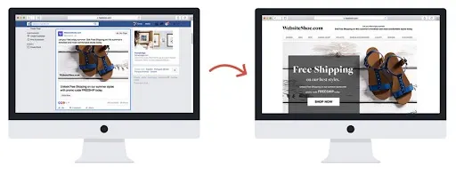
The more hiccups involved in the buying process, the fewer people who will make it through.
You want to simplify and clarify your process as much as possible.
With more clarity and consistency, people will flow through the buying process instead of leaving because of an unnecessary hurdle.
4. Don’t nickel and dime your potential customers.
This tip is simple. And yet, many ecommerce stores still make the mistake of hiding costs until the last second.
That includes shipping costs, confusing discounts that actually aren’t discounts, or other secret ways of adding to the price tag.
These only lead to cart abandonment and huge bounce rates:

The main reasons people abandon carts while shopping online.
Most businesses don’t do it because they want to trick their prospect.
They do it because they think that the customer will be more likely to buy if they don’t see the true cost of the product until the very end.
The reality is the opposite, as shown above.
It’s better to present the true cost from the beginning.
Even go so far as to include the shipping cost in the price and then advertise the product as having free shipping.
You could also provide free shipping for orders over $100. That will increase average order values and incentivise people to buy more.
Whatever you decide, don’t add extra costs at the end.
5. Use exit-intent popups.
An exit-intent overlay is a popup that comes to the forefront of the screen when someone tries to leave your website.
In other words, they are about to bounce, but your site throws one more thing in their way in hopes of saving a sale.
Something like this, for example:
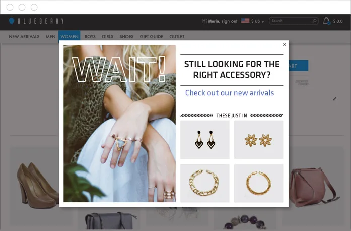
Some people view exit-intent popups as a cheap and annoying way of trying to get sales. But the stats tell a different story.
Exit-intent popups on ecommerce sites increase the conversion rate by an average of 20%.
But what should your exit-intent popup say?
There are a lot of different ways to do it. You can create something like the above version where you show the abandoner what’s new.
You could also offer a discount.
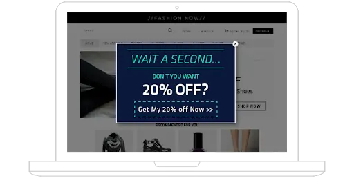
Or ask the person to join your email list.
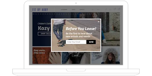
Or offer help finding the perfect product.
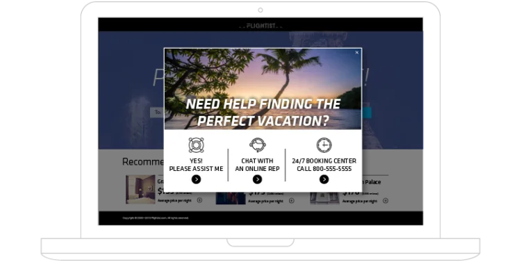
Or offer free shipping.
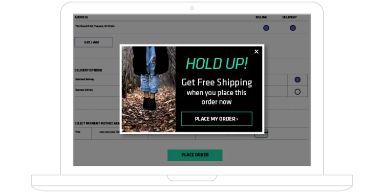
Whatever you do, add some flare to your exit-intent popup by offering something special to the person who’s trying to leave your website.
The worst thing they can do is leave and never come back — a nightmare for any ecommerce store.
But since they were already leaving, you have nothing to lose.
An exit-intent popup gives you one more chance at capturing their attention before that happens.
Conclusion
Remember that you’re building a relationship before you ever make a sale.
Every sale depends on one single overarching thing: trust.
If a consumer doesn’t trust you, they won’t buy from you.
To increase sales and decrease your website’s bounce rate, build a relationship of trust with your visitors.
Use exit-intent popups, optimise your product pages, segment your email list, make the purchase experience smooth, and stop hiding additional costs.
The more honest you are with prospects, the more they’ll buy from you.
Not necessarily because you’re cheaper or even higher-quality than the competition, but because they like you.
And likability is often what closes the sale.


