Advanced Tips to Master Every Type of Ecommerce Landing Page [+ 10X CRO]

A landing page is a web page whose primary function is to serve as a call to action for your promotional campaign, whether online or offline.
While any page on which a visitor arrives could technically be considered a landing page, for our purposes, we will only consider landing pages connected to a campaign. The reason? These are the only types of landing pages where visitors’ expectations can be managed and predicted (and optimized against for conversion rate).
There are two basic types of landing pages:
Lead-generation landing pages (also known as squeeze pages): A lead-generation landing page’s main purpose is to acquire the visitor’s contact information, giving you the opportunity to market directly to the prospect in the future.
Click-through landing pages: A click-through landing page’s main purpose is to shepherd a customer into the checkout process by persuading them to put a product into their cart.
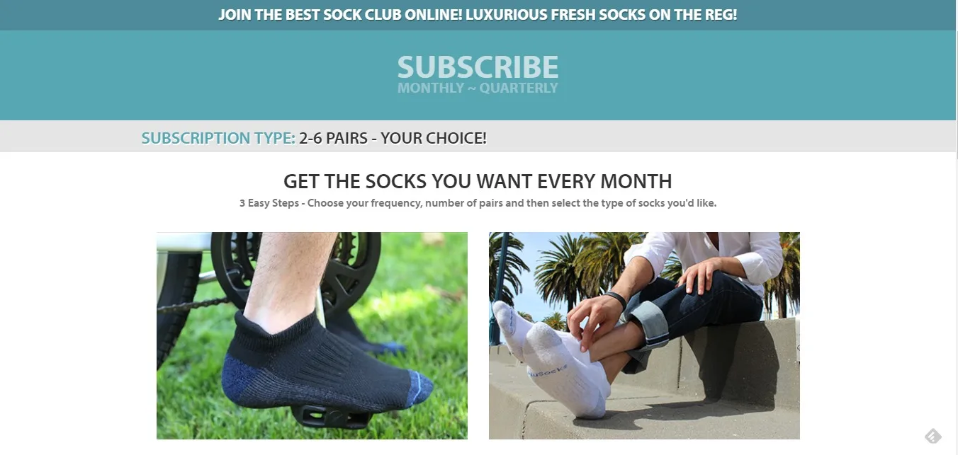
Here is an example of a landing page used on ecommerce website
In the ecommerce environment, click-through landing pages have the greatest potential to create additional revenue. While similar to product pages, landing pages have a few crucial differences:
They align closely to the marketing message or ad that is used to get prospects to the landing page
They are not connected to your main website by any links that might lead prospects away from the purchase
The key concept behind a successful landing page is relevance. The landing page design and copy must be relevant to the ad campaign or message that brings prospects to the page.
The key concept behind a successful landing page is relevance.
It must conform to the expectations it established in its content, language, and perceived benefits to capitalize on the prospect’s current motivation (which they clearly showed when they clicked the ad).
Here are the main elements of ecommerce landing pages — and tips to improve conversion rate across all of your campaigns.
1. Match Ad and Landing Page Copy
The first step in creating an effective landing page is to match the headline and copy messaging of the webpage to the text of the ad that delivers traffic to the page.
Prospects will be looking for this match, whether consciously or subconsciously, so you need to be consistent. If you promise a product with a 20% discount and free shipping in the ad, then let that message be the first thing a prospect sees when she clicks through to the landing page.
The headline serves as both the prospect’s mental link to the original ad, and functions as a value proposition in its own right. This means the entire campaign strategy should revolve around the ad campaign → landing page match.
2. Prominently feature the product
The second most-important element of every product landing page is the product itself.
It is the hero of the campaign, so the landing page should prominently feature an image of the product (or the product in use, or an image of the desired result the product can provide) in the form of the appropriately-named “hero” image. When you don’t highlight the product, conversion rates will suffer.
What is a hero image?
“Hero image” denotes an oversize banner at the top of a web page.
The role of the hero image is to draw attention to your product or its benefits, and its message should follow logically from the value proposition or headline. It should match the current stage of awareness of the prospect to reinforce your message.
3. Accurately describe the product and its benefits
The third most important element of a landing page is a detailed description of the product, listing its primary features and benefits. Depending on the nature of your product, its value and importance, and the ever-important stage of awareness of the prospect, the length of this section can vary.
For higher-dollar or more valuable products, prospects will be willing to devote more time to finding out about the product — and if you fail to provide them with the necessary information, they will leave.
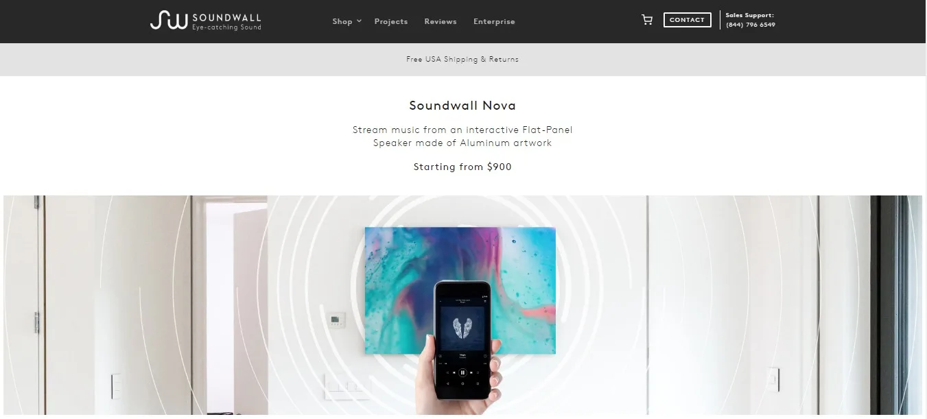
A hero image of a product in use, as presented by Soundwall product landing page
4. Landing pages must be credible
Due to the nature of the landing page and its purpose, which is to make visitors convert without any distractions, the landing page should aim to establish its own credibility, independently of your company’s main website.
Don’t forget to include some social proof so your prospects can see that the product has been bought, used, and appreciated by others.
Landing pages should include as few distractions as possible.
This includes calls to action!
To maximize the potential of your landing page, include only one call to action (i.e. one destination to which the page links; you can include multiple calls to action in placements throughout the page). If the purpose of the page is a product purchase, let “Add to Cart” be the only path that leads the prospect off the page.
In effect, the intent of a landing page is to take prospects from the initial research phase directly into your funnel and convince them to convert.
This places extraordinary demands on credibility and trust, and requires the perfect alignment of all elements to reduce friction.
6 types of ecommerce landing pages
There are several types of landing pages applicable to ecommerce.
1.Product page
The product page itself can be a landing page in its own right — especially since search engines will find your page and direct visitors to it.
The fact is that, usually, store owners do not plan for this. By checking for commonly searched phrases and applying SEO techniques, you can match at least the most popular keywords to the content of your product page. We will dedicate more attention to product pages later.
2. Category page
This type of page can also be considered a landing page — not by design, but by virtue of importance and “searchability”. Often, your prospects will search some general category of products and end up on a category page.
Where do you want them to go from there?
3. Search page
If a visitor decides to use search to find a specific product, there are a number of ways you can help them find and purchase what they are looking for.
The key is to create a “search results” page, which is simply a landing page that shows a prospect the matches to his search.
The trick here is to provide as much information as possible and give the prospect an accurate match to his search. If multiple items match the search keyword, show them all in a grid, so more are visible on screen, and enable users to filter the options by as many criteria as possible.
4. Promotion page
Promotion pages are the pages linked to ad campaigns. They may advertise your most popular products, for example, or seasonal items or sales. Either way, always remember that each of your marketing campaigns should have a dedicated landing page for the best results.
5. Coupon page
Whenever you offer a coupon or discount, it should have its own landing page. A coupon landing page should reinforce the promotional campaign, provide accurate instructions on how to redeem the coupon, inform the prospect of any restrictions of the coupon or discount, and (of course) provide a clear call to action to use the coupon.
6. Partnership page
If your site maintains a partnership and link sharing with some other site, you may have a partnership landing page. A referral partner landing page should provide prospects with a clear value proposition, an attractive incentive, sufficient social proof, a low-friction lead form, and a clear call to action.
Which pages are my landing pages?
It seems that there is no lack of potential landing page candidates on any given ecommerce website.
How do you choose which ones are landing pages?
Are they just the ones that have an ad or PPC campaign linked to them?
This is the conventional wisdom.
Organic search and product keywords also make product pages the most likely landing pages for an ecommerce website. This means that, for the purposes of design and optimization, you should treat each and every page on your site as a landing page.
Each of your product pages should feature only a limited number of links and potential distractions.
Concentrate visitors’ attention on the product being offered.
While it is impossible to entirely sever backlinks between a product page and the site itself, limit these backlinks to category pages, related products, and a contact page.
As we have seen, you can optimize your product for relevance by using the keywords you observe your visitors using to reach those pages. Unfortunately, you cannot observe the organic search keywords directly since Google search engine (as did other major ones) moved to https secure protocol. But, you can try your own search queries or refer to the search phrases people use on your own site search.
Landing pages used by ecommerce sites are most frequently click-through pages.
Click-through pages inform the prospect about the product and prime them to purchase. Once a prospect clicks the call to action, they enter the checkout, either by adding the product to a cart or by initiating checkout directly.
By thinking of your product pages as landing pages, you can increase your overall conversion rate. Landing pages are conversion machines — according to research by Wishpond, landing pages are 25% or even more likely to convert on average than the regular product page.
Landing pages are 25% or even more likely to convert on average than the regular product page.
There is no reason not to use landing pages that match your advertisement and make a clear and relevant offer to prospects.
Personalizing landing pages by using common personalization techniques and readily available information, such as geolocation, advertising channel, gender, etc., goes a long way toward making your landing page convert more visitors.
A deep dive into category pages
While brick-and-mortar stores have shopping windows and shelves to prominently display items and attract visitors to touch and feel products, ecommerce stores do not have this luxury (yet — advances in augmented reality and virtual reality may take us there someday).
Instead, the role of the shop window is fulfilled by the homepage, and the “shelves” are your category pages. Instead of walking the aisles, customers navigate the category pages.
How you organize category pages and navigation, as well as how the website itself is designed, often makes the difference between visitors becoming customers or walking away.
To find a starting point, refer back to your heuristic research, which should identify issues with user experience and user interface and the interaction of these elements with conversions.
Most ecommerce stores stock hundreds or even thousands of different products (SKUs). Navigating this multitude of options would be next to impossible for an ordinary user.
While users who know what they want could use the search option (you have one, don’t you?), the prospects who want just to browse would be hopelessly lost.
Categories are the basic navigational aid of every ecommerce website. When a visitor reaches the website, they can use categories to find the products they are interested in.
Therefore, the primary role of category pages is to make it easy and intuitive for prospects to find the product they want by organizing the products into logical compartments. For example, if a site sells electronics, it would make sense to have separate categories for mobile phones, tablets, and laptops.
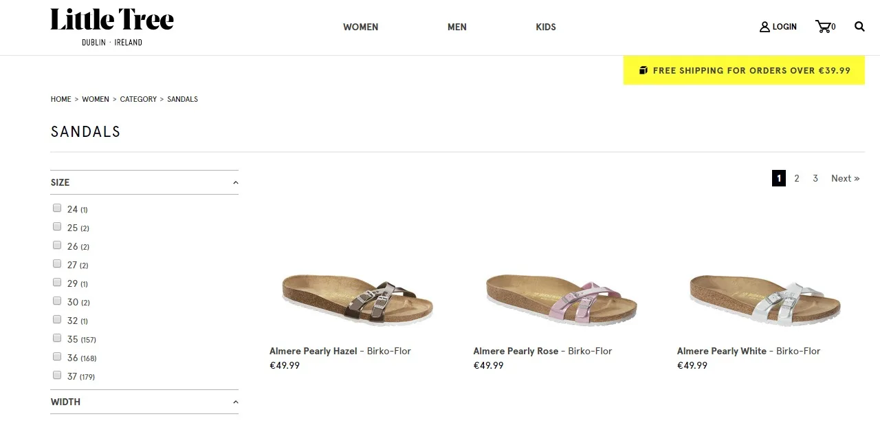
An example of a category page for “Sandals”
While category pages do not convert visitors directly, they enable visitors to reach the actual product(s) they want to purchase. Customers who use category pages to browse your ecommerce site have not yet decided to purchase, so they may need additional motivation.
When they present the right products and content, category pages can persuade those prospects to stay on the site.
Never forget that category navigation is primarily a user interface aid. It should always be judged by its effectiveness in helping customers find their desired product. Categories are hierarchical elements of the website and each main category can contain multiple sub-categories, which greatly ease prospect navigation.
Research by the Baymard Institute shows that the primary issue in categorizing products on ecommerce websites is over-categorization. That means that there are too many categories and, frequently, product attributes are given a category, so the categorization goes too deep.
Showing products that way not only confuses prospects, but may filter out parts of the website or other offerings — leading visitors to assume that, though there may be similar products here, this particular website does not stock them.
During the course of its research, Baymard found that issues connected to over-categorization on one of the sites they studied caused 80% of visitors to abandon their attempts to find the product they wanted. They left the website instead.
One of the basic concepts that should guide your product categorization is the idea of providing an information trail, or “scent”. Providing small pieces of information to prospects should lead them on toward the final goal: purchase.
The concept of scent is tied to humans’ inherent hunter behavior. You’re probably familiar with breadcrumb navigation — the reverse of the scent concept — which allows visitors to backtrack their journey on a website.
When you implement categories, enable the visitor to be aware of their relative position within the product catalog hierarchy at all times. This allows the visitor to maintain control over their experience and easily change the category if what they’re looking for is not contained in the current category.
If a visitor finds they are effectively stranded in what seems to be a dead end, they will likely leave the site altogether.
When you implement categories, make sure each of the points in the hierarchy is clickable and leads to a specific webpage. Make sure you do not make the mistake of forgetting to link parent categories to a specific page. Even Amazon makes this mistake.
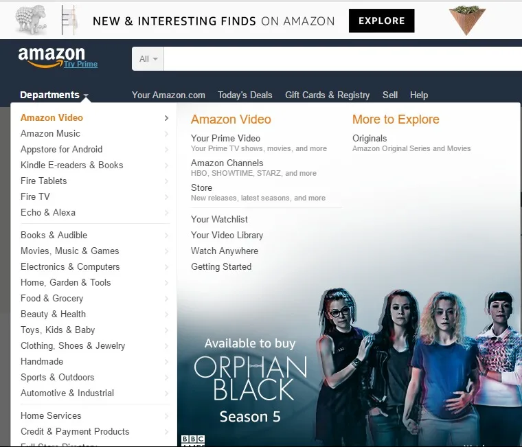
Not even Amazon does everything right. Although the category names on Amazon.com appear as links, you cannot click them to be taken to parent category page
By creating individual category pages, you get an opportunity to present each category to visitors with more detail, and lead them on to products and subcategories much more easily than by using only a single word in a dropdown menu.
Parent category pages should list all the subcategories with brief descriptions.
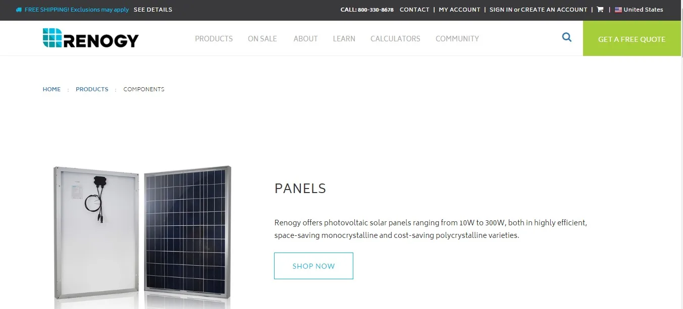
Renogy uses this concept very well and if you scroll down the page you can see descriptions of individual categories as well as visual representation of it
There are two basic ways to make category pages:
using text
using images
By using textual representation, you can cram more information into the screen space; however, graphical representation may be more effective. While some products may benefit from graphical representation, such as clothes or furniture, representing other products graphically (like books, for example) will provide no measurable benefits.
If you elect to use graphical representation of categories, be sure not to make the category look like a single product, as it may create the impression that there is only that one product in the category.
The graphic should represent all the products in the category, not restrict it to individual or subcategory products.
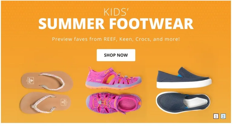
Example of a well-done graphical category representation, used by Zappos
In summary, the product categorization should ideally follow these principles:
Hierarchy guided by scent
Intuitive and clear naming
Breadcrumb navigation
Use filters instead of categories to differentiate product attributes
If you use graphical representation of different categories, make sure it relates to all the products in the category
How CRO can help you improve category usability
We are now familiar with the potential issues that can crop up in category implementation. Let’s now discover how to locate those issues in order to optimize your website’s user experience.
The best way to check for issues in categorization is to user-test the interface.
Create a task for your testers to complete: for example, “Find this specific product on our website.”
Observe how long it takes users to complete the given task, and see if they follow the process you envisioned when creating the interface.
If testers have trouble completing the task, then your interface has issues that you need to address. For example, you might realize that you misnamed your categories — or that the graphical images used to represent them are not intuitive.
The other way to check for categorization issues is by using session replays.
This method is less structured, but pulls from a larger sample. Most mouse-tracking tools include session recording, and you can access individual sessions and observe how a visitor interacted with your website. The process is time-consuming, but it is likely to allow you to uncover issues that hinder your visitors.
Finally, you can use your analytical tools to check how visitors interact with the website.
While these give aggregate and average metrics, you can see if most visitors struggle with navigation by observing session duration, bounce rate, exits from the page, and events such as clicks on category navigation menus.
Taken together, these metrics may signify larger trends that hinder large segments of your audience (such as mobile users or those on certain browsers).
Of course, any solution you come up with needs to be tested. As you’ll recall, the layout of category pages is one of the ideal applications of multivariate testing (provided you have enough traffic).
Optimize your product pages
Why are product pages important?
As visitors narrow down their search, they reach individual product pages. Product pages are, in many cases, the most-visited pages on ecommerce websites and often serve as an entry point from search/PPC efforts. It is therefore very important to make them one of your top priorities in the conversion optimization process.
Now we’ll concentrate on the particulars of ecommerce product pages and how CRO can help identify possible issues and fix them to increase conversions.
As we’ve discussed, the product you sell cannot be touched or tried on (in most cases) — so the customer must take your word, written or spoken, that the products do what you claim and look like the photographs you publish (which might well be Photoshopped).
Are the features and specifications you list on your product pages real?
The customer can only find out by getting their hands on the product. And a whole host of trust issues comes into play here.
The task of the product page is to transcend these issues and persuade the visitor that by buying a product, they will get exactly what the page advertises. To achieve this effect, product pages rely on the use of many different graphic and copy elements:
Headline
Product description
Cost
Marks of quality/expertise/trust
Product images
Testimonials and/or reviews
Ability to compare different products
Navigation
Calls to action
Ability to customize the product (color, size, etc.)
Interactive elements to engage the audience and showcase the product
Detailed information
Prominent display of shipping terms and conditions
Indicators of scarcity/urgency (for popular items)
Contact information for your company
Content related to this product and/or embedded outside reviews
Chat or other venue of direct contact with sales personnel
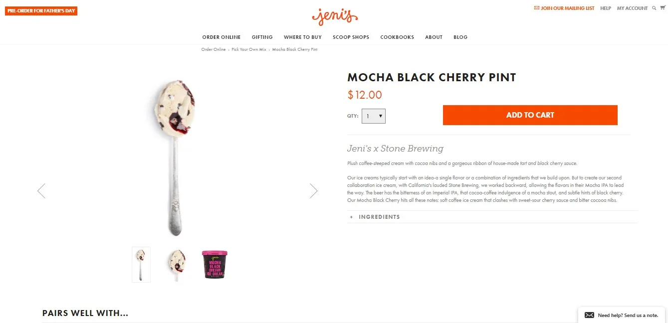
An example of a product page that has most of the aforementioned elements
These elements should ideally all be included on the product page. Their role is to provide the customer with product information that’s as complete as possible; alleviate trust issues; show that other people bought, like, and use the product; and finally to nudge them them to convert.
The key concepts behind successful product pages are:
A product story consisting of a compelling headline, immersive images or videos of the product, and an inspirational story conveying the most important benefits of the product — how to use the product to solve some problem or make life better.
Indicators of quality that further increase your customers’ trust in your product or help them identify with it (for example, badges or seals that prove the product fulfills ecological standards or is sustainably manufactured or grown).
Social proof showing that the product is bought and used by other people, preferably the visitor’s peer group (increased personalization can help here).
Calls to action, scarcity indicators, fast delivery and other psychology-based elements that may nudge the customer to buy.
A user experience and interface that enable the customer to quickly and effectively notice calls to action, check trust elements, customize the product, and compare the product to other products your store offers.
Engagement and commitment elements, such as curated customization of the product or micro-conversions — such as notifications for price drops, “Add to Wishlist” features, or restock notifications. These elements, while not tied to immediate conversion, create commitment and increase the likelihood of a purchase down the line.
How CRO can help you improve product pages
Applying CRO research methods to product pages can help you identify issues that may hinder a page’s performance, conversion-wise.
Examine the heuristics of the page
This will indicate navigational issues, lack of information, and other design issues. Removing or fixing these issues is the first task of optimization.
For example, consider an overcrowded product page with too many images and not enough white space. Did you know that minimalist design and less visual complexity are correlated to the perception of beauty? Visitors often perceive simpler sites as more beautiful than visually complex sites.
Quantitative analysis can further enhance your product pages
You can observe which products are popular and what images visitors find most compelling, as well as estimate which interactive elements were most popular and led to conversions. By using segments, you can identify the visitor groups that find your products most attractive.
Use heat and scroll maps
By using these, you can uncover the most frequently clicked elements and how deeply visitors scrolled — then remove the elements that appear to serve no useful purpose.
For example, if you’ve placed a link on your product page, but it’s rarely, if ever, clicked, you can test its removal.
Use qualitative research and surveys
Qualitative research and surveys can help identify elements that are missing on the product pages and that visitors would like to see. By reading support call logs or chat box logs, you can spot what information visitors frequently ask for that is not present on your product page.
For example, you may discover that a significant proportion of your customers would like to see a description of a feature you did not think was significant enough to include. By adding it, you might nudge some of those who complained, or similar visitors, to convert.
An important part of customer and qualitative research is using customer reviews to enhance product descriptions.
Specifically, take care to use the exact wording your customers use.
This will help users identify more with the product (and this is also the reasoning behind the axiom “Your customers are your best copywriters”).
It goes without saying that product pages must be technically flawless, so be sure to apply your technical research here.
Ensure there are no broken links to product images, that call-to-action buttons work, that product videos are playable, and that mobile users have no trouble viewing the product pages. These issues can cost you dearly in conversions.
Next, we’ll walk through how you can establish a testing culture for your brand.

Edin Šabanović is a senior CRO consultant working for Objeqt. He helps e-commerce stores improve their conversion rates through analytics, scientific research, and A/B testing. Edin is passionate about analytics and conversion rate optimization, but for fun, he likes reading history books. He can help you grow your ecommerce business using Objeqt’s tailored, data-driven CRO methodology. Get in touch if you want someone to take care of your CRO efforts.
