White Backgrounds Be Gone: How Brands Add Colour and Creativity to Product Photography

We’ve edited over fifteen million product images at Pixelz, and the statistics are pretty clear:
Ecommerce site owners love white backgrounds.
We analysed seven million images and found that 76% had their original background replaced with pure white. An additional 16% removed the background and opted for transparency, while the bulk of the rest simply stuck with their original background (usually white).
Out of seven million edited product images, about 92% removed the background. Via Pixelz product image report.
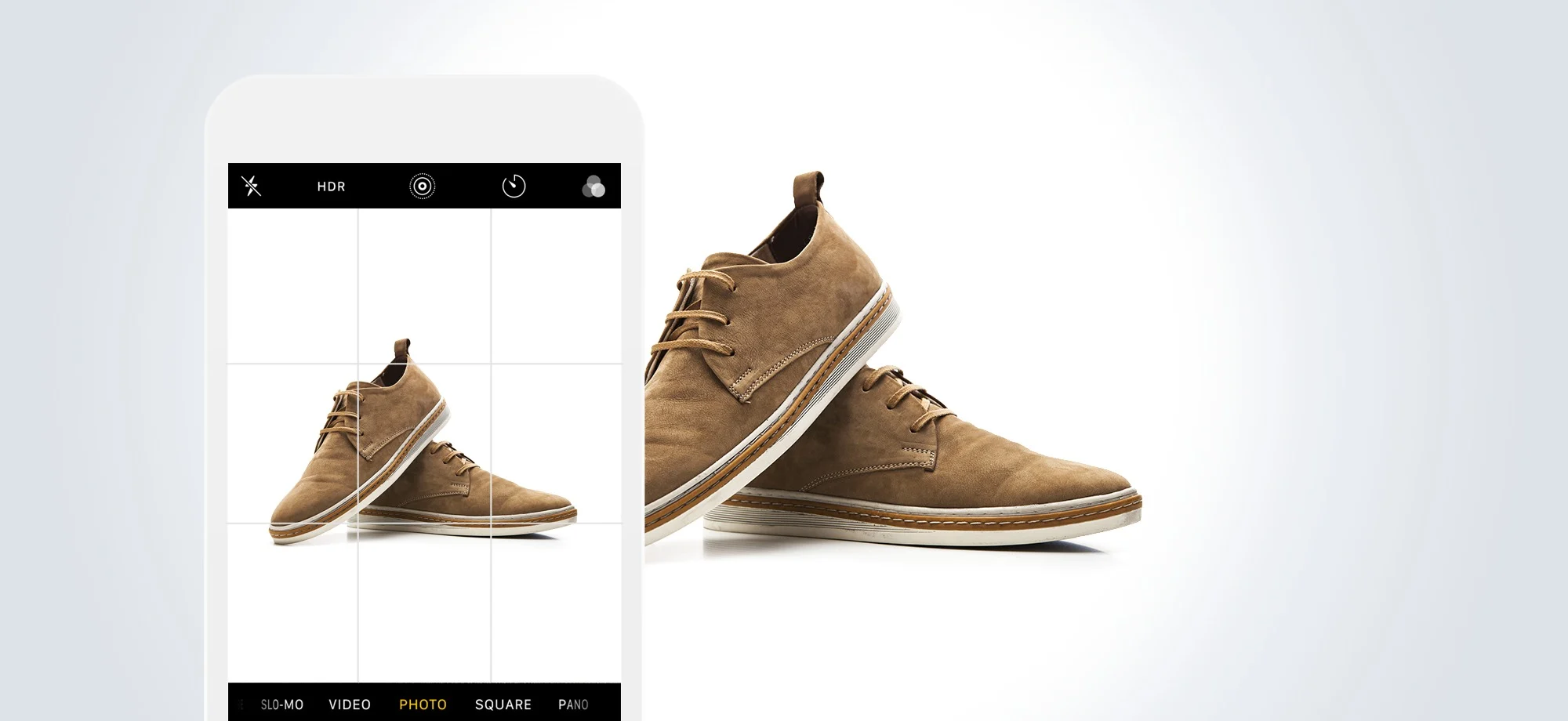
There are plenty of great reasons to shoot on a pure white background and remove it in post-production.
It’s consistent
It’s clean
Colours are true
File size is minimised
It’s also boring.
Calm down: we love white backgrounds, too. We preach the advantages of removing the background all the time; we even used to be named “Remove the Background.”
That said, there’s a big difference between category pages and product pages, and there’s room for creativity in ecommerce.
One size does not fit all.
If you’re itching to try something new, or looking for creative ways to brand your category pages and product images, here are four alternative approaches to white or transparent backgrounds that successful companies are using today.
1. Solid Colour Backgrounds – Zara
Zara sometimes uses dramatic solid coloured backgrounds, particularly when the product itself is solid black or white.
Zara likes to mix in solid coloured backgrounds on their category pages, alongside traditional white and neutral backgrounds.
Most sellers are worried, quite rightly, about creating colour confusion for the customer. Zara avoids that problem by using coloured backgrounds mostly with solid black or white products.
Zara stays neutral for subtle colour variations, then goes dramatic again for a solid white product.
When a product has subtle patterns or colour variations, they use a more traditional white or grey background.
Colourfully patterned products need a neutral background for accurate perception.
You can be certain that all the product images with a coloured background were shot against a white or grey backdrop, and then coloured in post-production. In fact, all Zara’s product pages (as opposed to colourful category pages) feature product images on a neutral background.
Ensure accurate white balance during photography by using a grey card and adjusting your camera settings.
2. Themed Collection Backgrounds – Shabby Apple
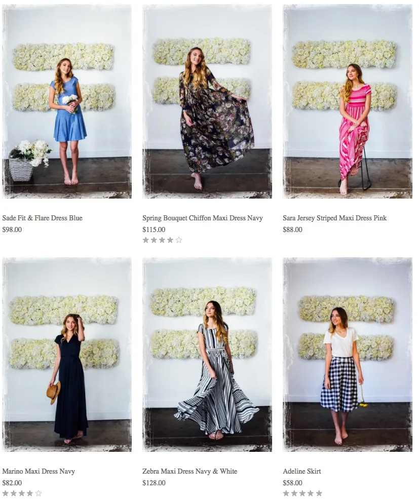
Shabby Apple produces themed collections, like “Blossom Bright” and “Silver and Ice.” All photos of products within the collection share context — they’re shot in the same studio or at the same destination location.

Shabby Apple’s “Blossom Bright” collection has a consistent themed background matching the brand and collection’s aesthetic.
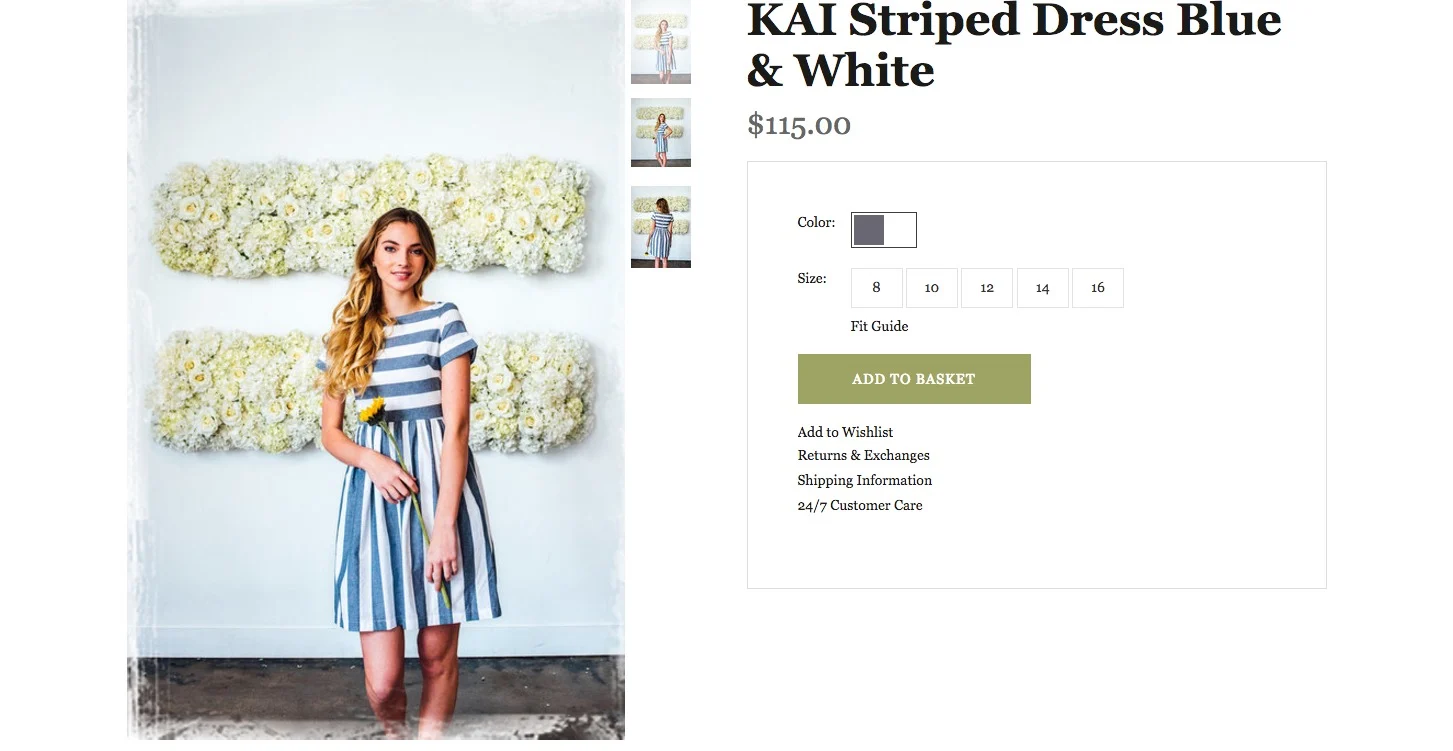
Shabby Apple doesn’t just use themed backgrounds for the category pages. When you click on a photo, all the product images for that item are from the same shoot and show alternate angles, maintaining continuity for shoppers.

Product pages contain alternate angles with the same model and background.
Building and propping a studio location allows you to control light and create consistent images.
Using themed backgrounds can be an effective branding strategy, but remember: your product is the star. Don’t make your background too busy, or too different from photo to photo, or it will turn into a distraction.
Shabby Apple’s light yellow and off-white flowers on a white wall, with subtle related propping like holding a flower, is a nice example of supporting your product without overwhelming it.
3. On-Location Images – Free People
Free People uses lookbook images taken on-location on their category pages.
Free People uses on-location lookbook images on their “Dresses” category page to create a complete vision for their brand. Shots are on-location with models in motion, interacting, styled and propped. Taken together, the images tell a story.
On the product page, alternative images have more traditional backgrounds.
Shooting on-location is considerably more expensive and slower than studio photography. Even a brand like Free People, selling dresses at a $700 price point, doesn’t use on-location images everywhere.
As you can see on the left, the alternate shots of a dress on the product page are more traditional studio images.
How much might it cost you to shoot a lookbook?
Well, to start with, probably several thousand dollars a day for just a photographer and model. If it’s a destination shoot, you’ll need to pay for airfare, accommodations, on-site travel and food for your entire crew. Costs can get pretty steep in a hurry.
The best advice I can give here is to tell you to find the right photographer. Don’t get too cheap out there, or the rest of your time and money will be wasted. If you have to cut corners to save your budget, do it somewhere else –– like shooting locally instead of travelling.
You’ll be able to use your lookbook images a variety of places. Throughout your website, in emails, on Instagram and other social networks, in a brick-and-mortar store if you have one, in catalogues –– everywhere, really.
A lookbook will cost you, but it’s worth it.
4. Instagram – Trend Director

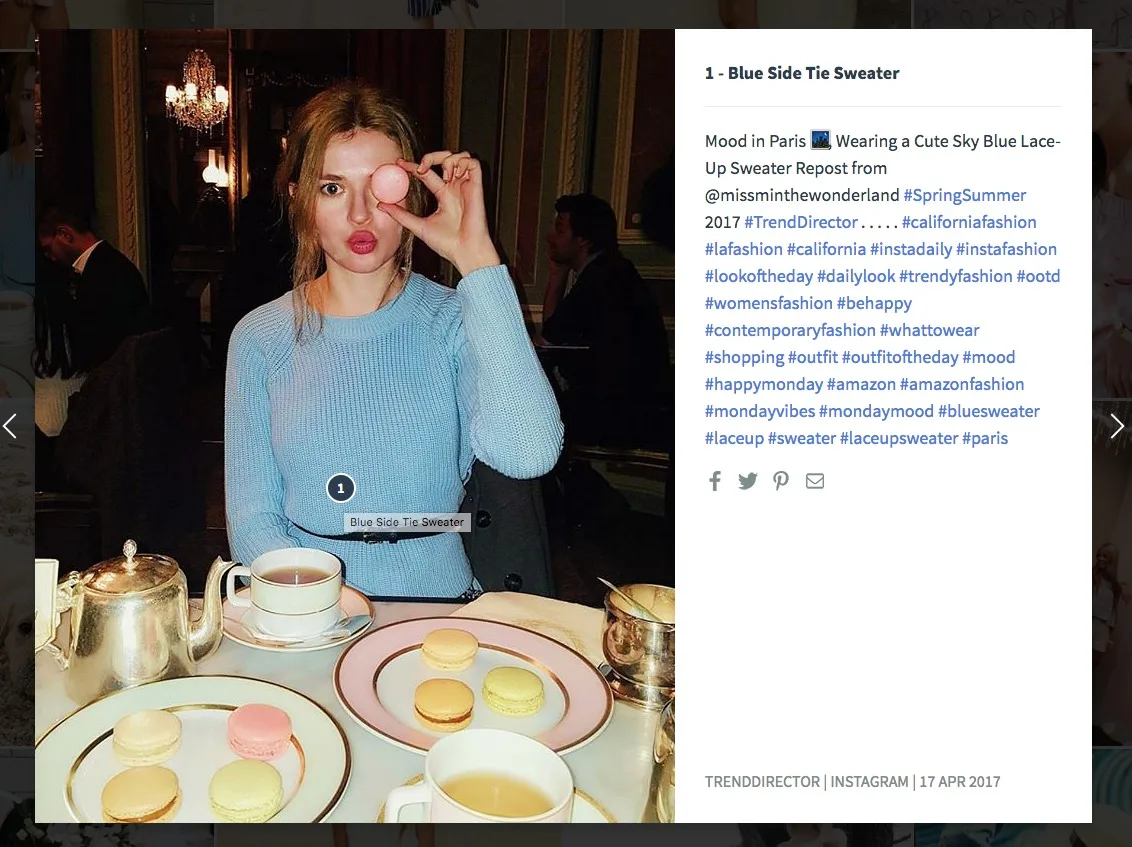
Trend Director uses their Instagram feed like a category page on their homepage. All those square images? Those are Instagram posts.
Trend Director uses their own Instagram feed to create a shoppable, constantly updating homepage. It’s a modern approach with a plethora of benefits.

Clicking on an image allows you to identify items and navigate to the product page for any product.
The less formal nature of Instagram, and the way each image is expected to be self-contained, allows for a huge variety of settings. The images aren’t expected to be visually consistent, so long as they stay on brand.
It’s also a good way to gain followers to your Instagram feed.
Once you get to the actual product page you get a more traditional white or neutral background, along with alternate angle and detail shots. That allows your customer to get a more complete understanding of your product, and reassure themselves regarding style and fit before placing an order.
Neutral Backgrounds Still Rule Product Pages
As you probably noticed, most of these approaches are for category pages and their equivalents. Once you get to an actual product page, product images have white, transparent, or neutral backgrounds.
Even colourful Zara uses neutral backgrounds on their product pages.
Removing the background makes your images more consistent, removes distractions, and minimises file size.
Plus, many marketplaces require white or neutral backgrounds for product images, and you really don’t want to reshoot for different channels.
If you’d rather spend your time and money on creative photography in order to brand yourself, consider outsourcing your product image editing. The ability to scale up or down with seasonal needs, pay per image, and get processed images back in under 24 hours will simplify your workflow.

Thomas Kragelund is the CEO and founder of Pixelz, a leading product image solutions partner for internet retailers, bloggers, designers, photographers and webmasters worldwide. He has been working in ecommerce for the last 15 years. Sign up today and get 3 product images edited for free.


