How 12 Wildly Successful Online Stores Use Visual Merchandising to Drive Sales (and How You Can, Too)

How 12 Wildly Successful Online Stores Use Visual Merchandising to Drive Sales (and How You Can, Too)
Get The Print Version
Tired of scrolling? Download a PDF version for easier offline reading and sharing with coworkers.
A link to download the PDF will arrive in your inbox shortly.
Visual merchandising has long lived in the domain of brick-and-mortar stores. It is how retail professionals decorate, organise and reorganise a store’s layout and aesthetics to improve the customer experience and better communicate the brand’s identity.
How you visually merchandise a store touches on all aspects of your brand, your products and your bottom line. Effective visual merchandising increase and improves many metrics, such as:
Engagement and time on site
Store navigation and ease of use
Average order value
Conversions
What is visual merchandising for online retailers?
Visual merchandising is how online retailers pull customers in from the streets (think display windows), and create an inviting, branded experience within their stores. And, visual merchandising often goes far and beyond just vision. Often, all senses of used to by merchandisers. Here are a few examples you may easily recognise:
Smell: The smell of an Anthropologie store (They always have a Volcano candle lit)
Spatial Feel: The in-store colours and layout of a Whole Foods (Floors are almost always polished concrete. Green accents pop around the store. Customers gather often around the salad bar and health and beauty sections).
Sound: The co-op reminder, and friendly sales staff, present at all REIs (“Well, we are a co-op so that means we don’t abide by board members. Our customers are our board members!”)
And, most stores also combine elements of psychological marketing known to drive increased purchases. These include:
Social proof: For example, branded shopping bags which clue other shoppers into what (and where) others are buying.
Reciprocity: Think free gifts and gift wrapping
Commitment and consistency: This is about getting a customer to commit. Think about all the stores with loyalty programs or their own cards. REI’s co-op is also a commitment.
Authority: This is why brands do events with influencers like book signings or pop-up shops. They want you to think they hang out with the authorities of particular topics.
Liking: This is why friendly salespeople are essential, as well as why more subtle tones (like Anthropologie’s smell) matter. You need to like the space you are in and the people you are with.
Scarcity: This is why there is always more of any given item in the stock room, but not on the floor.
Visual merchandising isn’t just for retail stores, though. More and more online store are bringing these concepts to life on the web. This is because ecommerce has gotten more and more competitive.
With a majority of brands adopting an omnichannel strategy (selling on their site, on Amazon, on Facebook, etc.) there becomes an increased need to differentiate each selling channel. Given the limitations of selling on channels you do not own (Amazon, Facebook, etc.), your website becomes the hub for increasing engagement and conversions in a controlled way.
Customers are looking for experiences from webstores, ones they cannot get on Amazon or Facebook. And this is where visual merchandising comes in.
Misconceptions About Visual Merchandising Online
Visual merchandising isn’t just about having a pretty site –– but it does start there. Your site needs to be easy to navigate, attractive and work well both on mobile and desktop. These are entry level needs of any online business.
Beyond this, many online brands stop with the merchandising work. This is for a few reasons –– and all are misconceptions:
1) I have a small product catalogue, so I don’t need to merchandise my site.
Historically, online brands with small catalogues has ignored visual merchandising. Business with larger catalogues and a high number of SKUs, on the other hand, have long merchandised online. This was to help customers find the category of product they were looking for, and move them further down the conversion funnel.
This is a misconception. Brands with small catalogues also need to merchandise their site, though the tactics for doing so might vary from those with larger catalogues.
Why do you need to merchandise? Because customers are looking for an experience, not just a website selling products. The examples below will walk through a few small catalogue tips and ideas to drive this home.
2) I use faceted search, so I don’t need to merchandise my site.
Brands with larger SKU counts often use faceted search (also known as product filtering) to allow customers to take their own journey on a site. This means a customer comes in, and uses the search tool to narrow down to the product keyword they are looking for.
For some customers, this works well –– especially those that have already bought from you before. For new customers, however, it is important that you merchandise your homepage or landing page (if you are sending them to a specific page from an advertisement) to move them down a purchasing funnel and drive increased brand engagement and understanding.
What merchandising helps to do is introduce and reinforce your brand, as well as highlight your best aspects –– ideally earning a sale much faster than you would without merchandising.
3) Merchandising allows you to own the experience, rather than giving the customer full reign.
I’m not a fashion brand or a consumer-facing, so I don’t need to merchandise my site.
Fashion brands are the most notorious for visual merchandising –– and arguably the best at it. This is often due to the seasonality of their collections, as well as the large SKU count. Many of the examples below will be of fashion brands.
That said, I’ve gone through to find multiple B2B and non-fashion brand examples as well so you can see exactly how others are pushing their consumers through a funnel via visual merchandising.
4) Visual merchandising takes time and effort, I’m best spending on driving traffic or optimising email campaigns.
All online stores need a customer acquisition and retention strategy to do three things:
Increase the average order value (AOV).
Increase the frequency of purchase, or the average number of times each customer buys from you.
Increase the total number of customers.
Visual merchandising helps with both #1 and #2. It is well worth your time. And, it doesn’t have to be difficult. I’ve included a few examples below of straight-to-the-point visual merchandising that works (and takes hardly any time at all).
Visual Merchandising Tips and Examples
The below site examples have been pulled due to their clear expertise in visual merchandising, but also to show you a wide range of online stores using visual merchandising in their own ways and for very different categories.
These include:
Clothing and Apparel
Hardware
Gifts
Food
Let’s dive in.
1) Homepage Storytelling
Your homepage is often the first place a new potential customers lands. It is where they begin to get a feel for your brand. This is where they learn about who you are, and if you are the type of brand they buy things from.
To do brand storytelling on your homepage well, you need to have a few different things within your visual merchandising of the page:
Images and text
Clear storytelling line throughout the page (use the inverted pyramid journalists often employ, where the most important information comes first, and gets more and more detailed throughout)
Explain your product, how it works, why it is great (as visually as possible)
Use social proof (customer reviews)
Use authority proof (accolades from top tier media like Mashable, The New York Times, Racked, etc.)
Liking proof (Typically social buttons or call outs)
Have a clear call to action (these are CTAs throughout the site)
Here are a few examples.
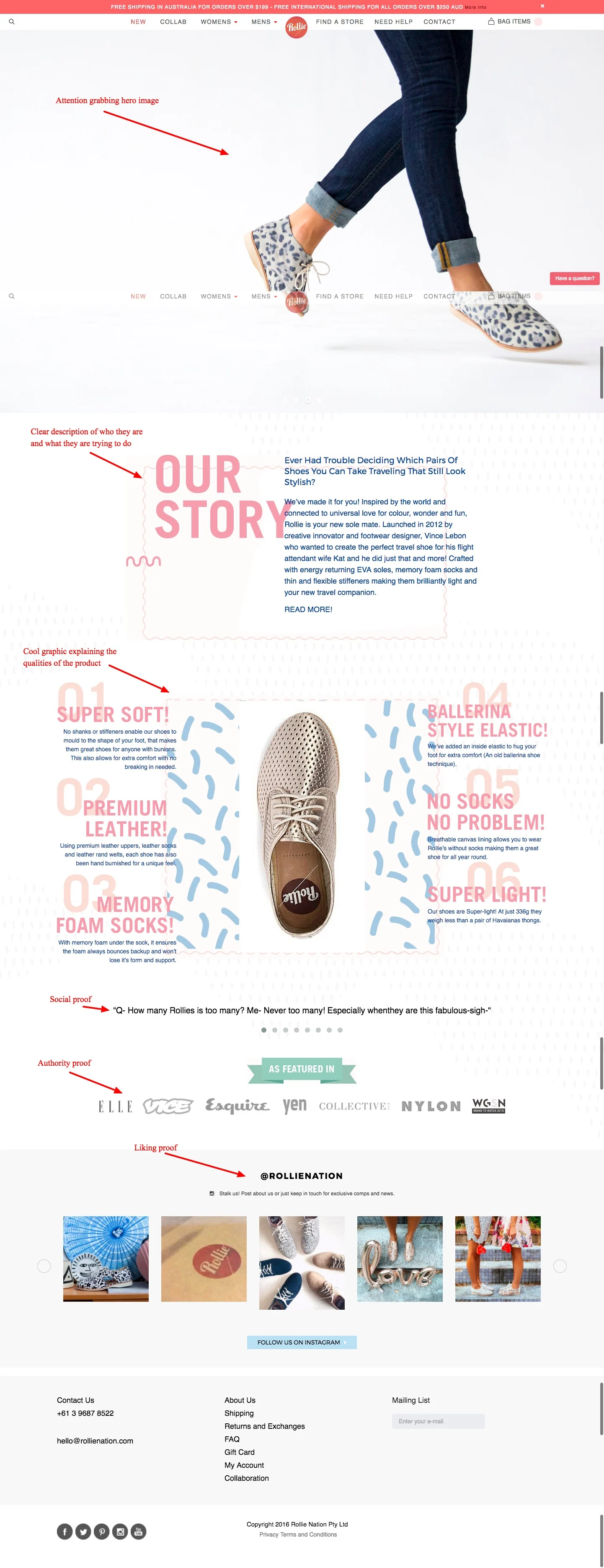
This one is long, but stick with it! It has all the elements needed on a homepage for storytelling. Yours doesn’t have to be this long, but Hyphen Sleep is in a competitive market. It is essential they showcase exactly how they are different.

This one below is a great example if you are targeting various markets. It is a great example of using storytelling to show your product growing with your customer base.

2) Collection-Based Only
Collection based visual merchandising is most often used by clothing and apparel brands. This is because their products are often collection based, which makes the creation of collections easy.
Collections don’t have to just be used with fashion brands though. Collections allow customers to self identify with the items they are looking for and dive deeper into the site for increased engagement (which will up your search rankings) and hopefully conversion.
Here are a few tips for collection based visual merchandising home pages:
Use attention grabbing images to attract users to each collection
Make sure each collection is clearly named (and that the photo doesn’t over shadow the text)
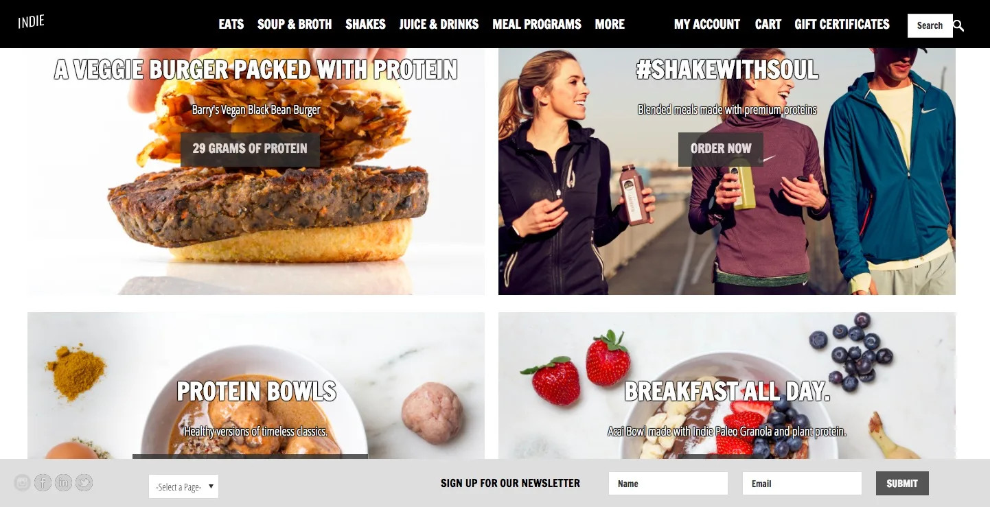
Place collections in a grid style, to keep the site looking clean and give the reader a clear reading line
Collections organised like tiles (similar to Pinterest) are popular right now
Here are a few examples.

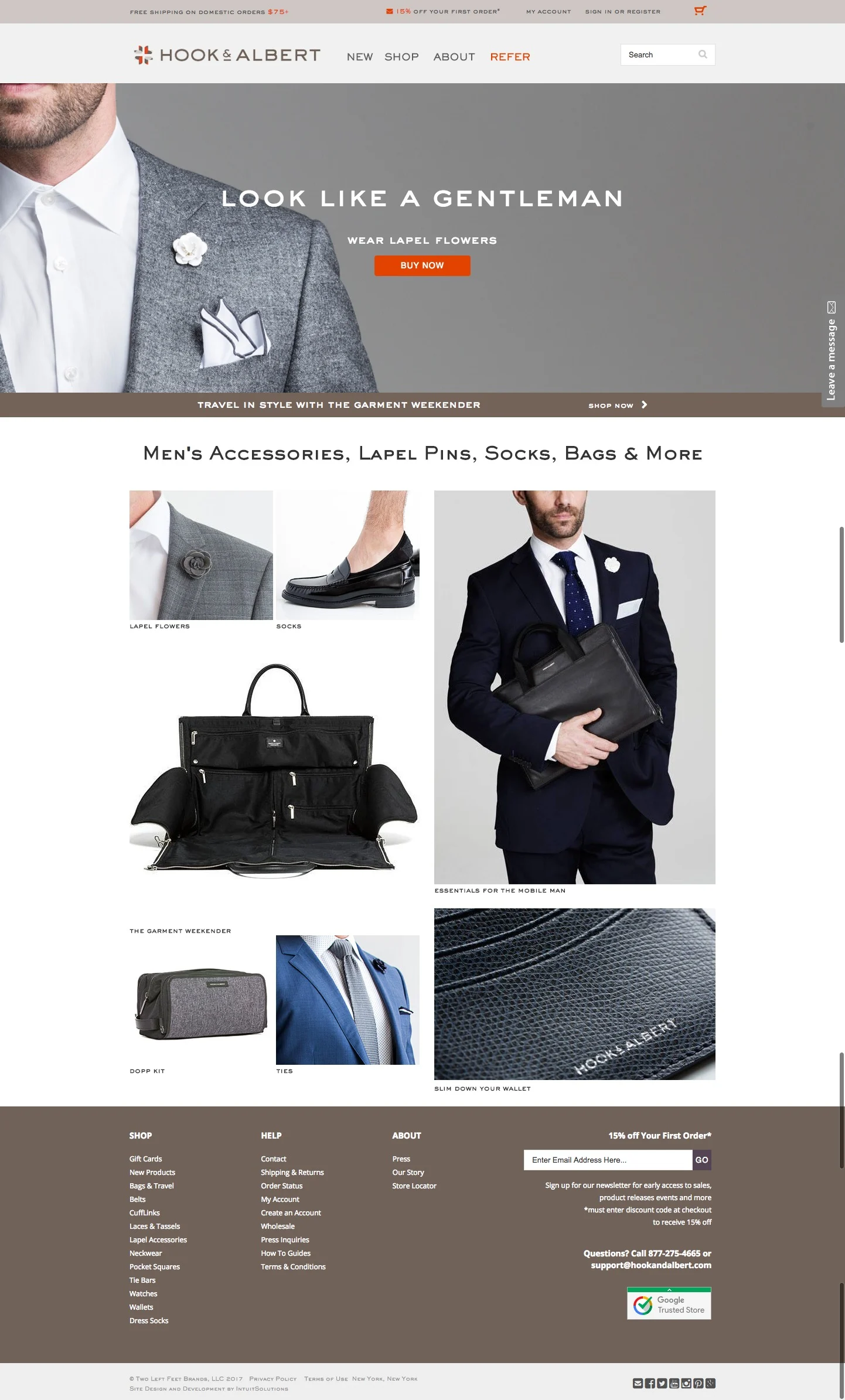
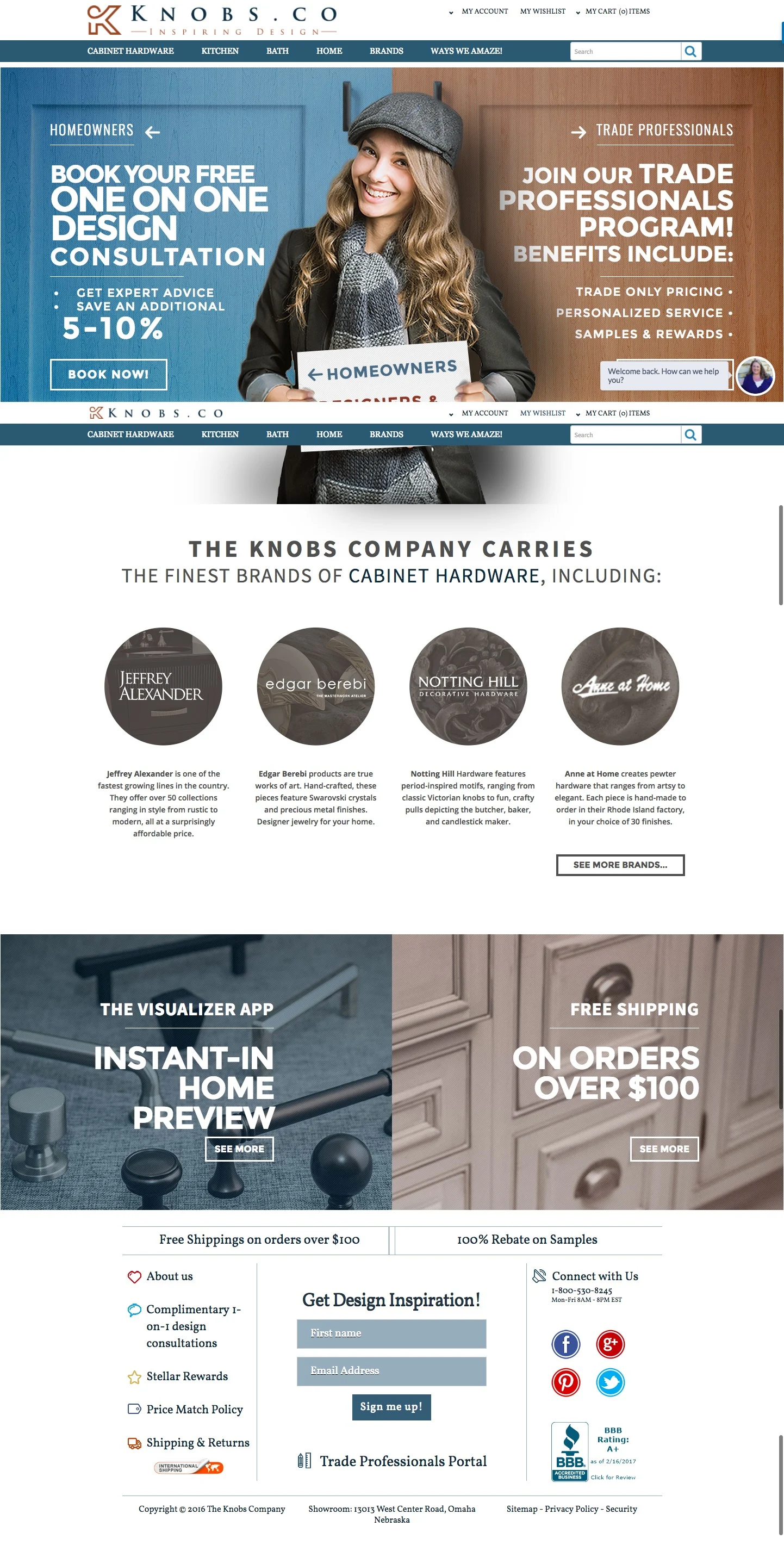
Here’s a good example of B2B merchandising:
3) Collection Based + Featured Products
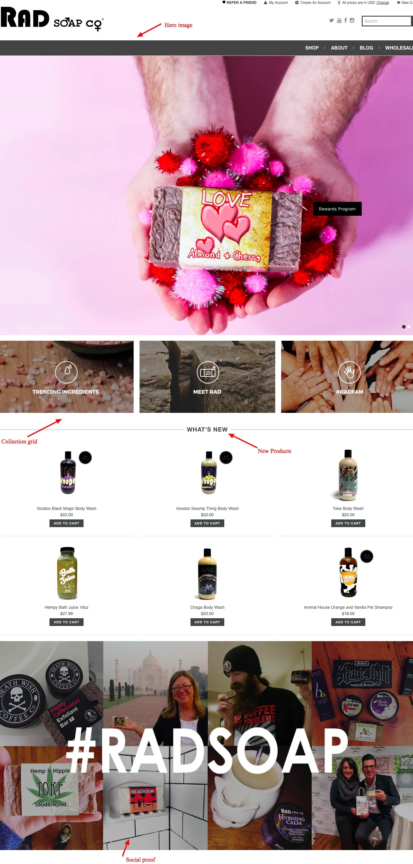
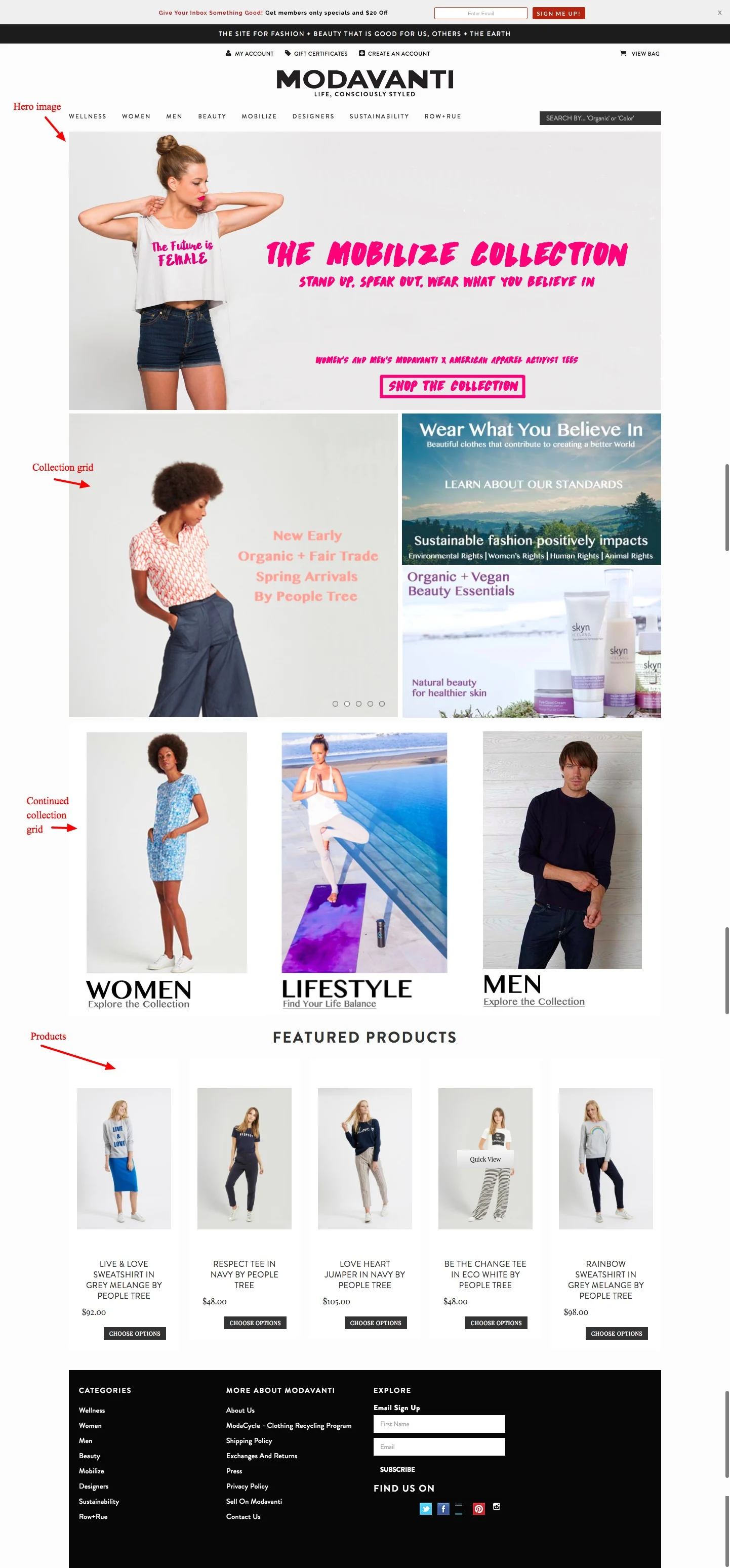
Many brands choose to use both collections as well as featured or best selling products on the homepage. This allows browsers to deep dive into specific categories, or find their way to a product page much quicker.
Typically, these pages consist of:
Hero image
Collection grid
Product grid
Social proof
Authority proof
Liking proof
Here are a few examples:

4) Quick and Easy Visual Merchandising
All right –– I promised earlier in the article I’d show you some examples that take a bit less work. After all, getting enough social proof points (which are required on all of these) can be hard for businesses or subsidiaries just starting out.
Plus, if you are looking to save some money and don’t have a developer, using an out-of-the-box template and merchandising that is much easier as you get going.
In a quick and easy visual merchandising strategy, you want to use your homepage in as engaging a way as possible. You have a few options:
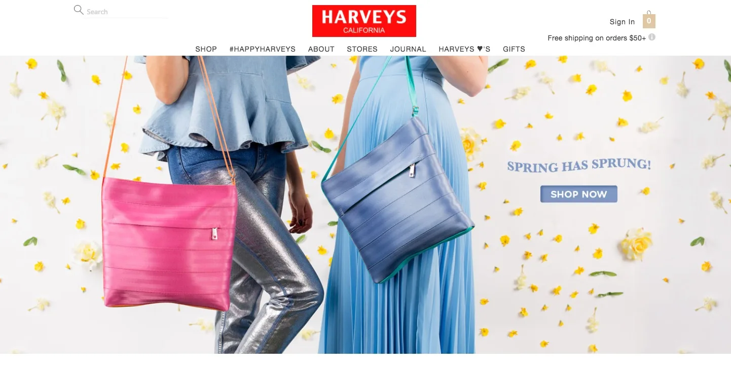
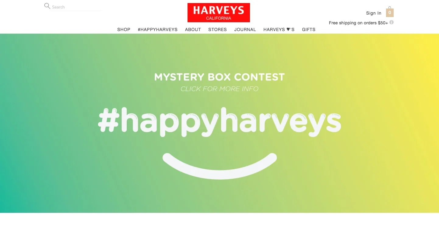
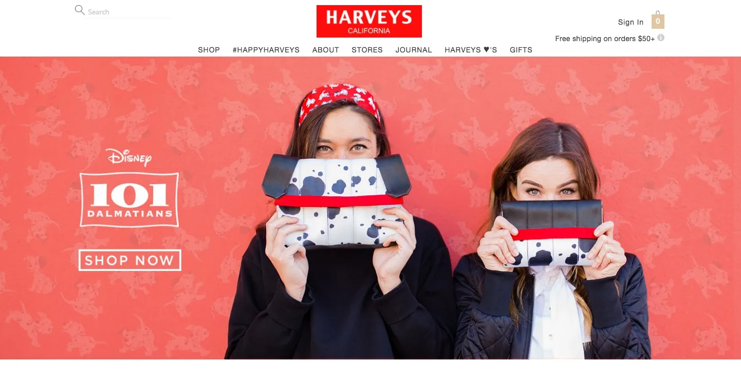
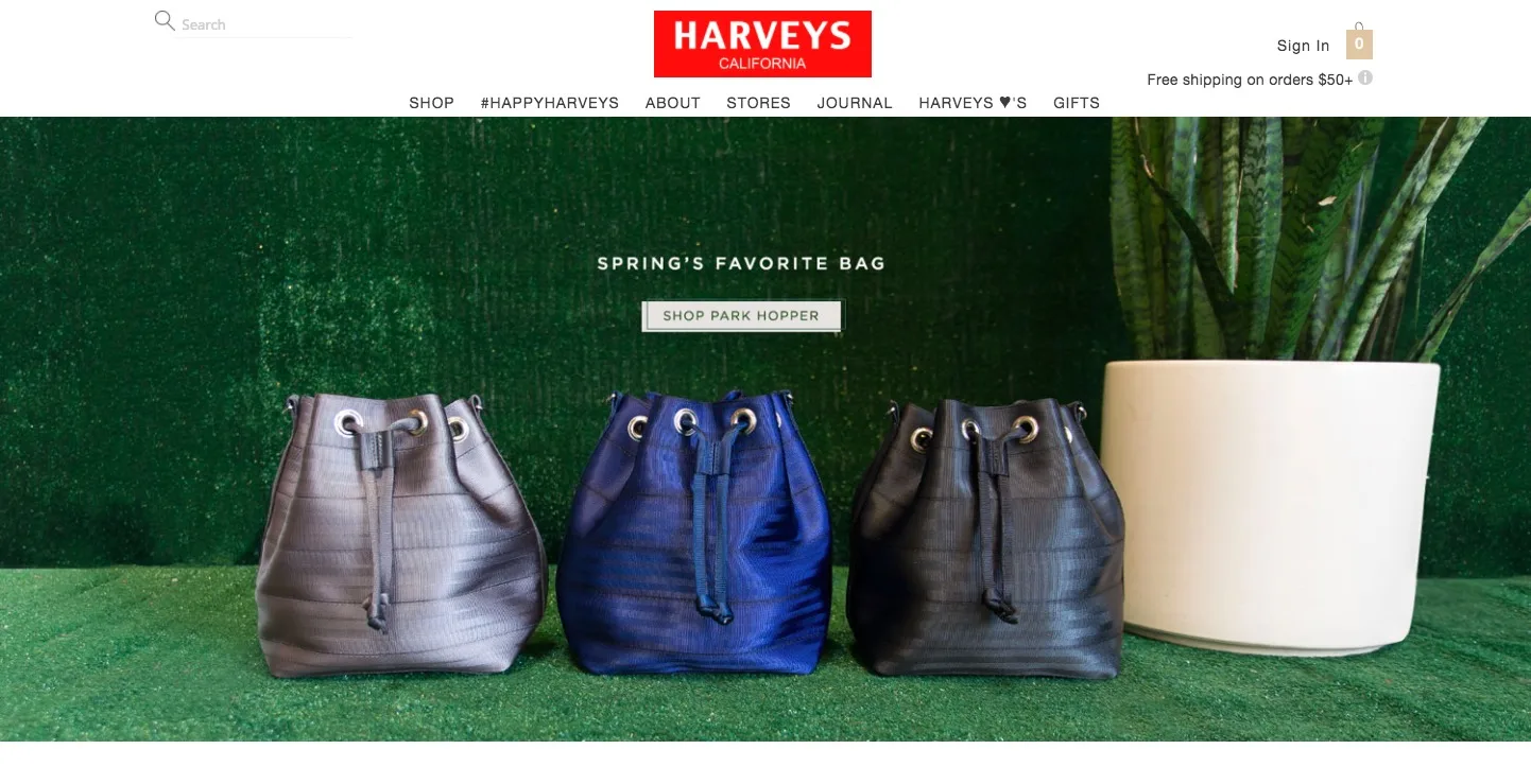
Use the carousel to drive people to collections.
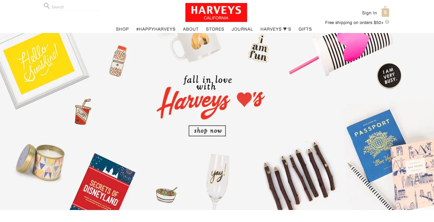
To do this well, each image needs to be particularly eye-catching and relevant to the collection at hand. Here are the 5 carousel images being used by Harvey’s to drive readers to collections.
Make products your focus.
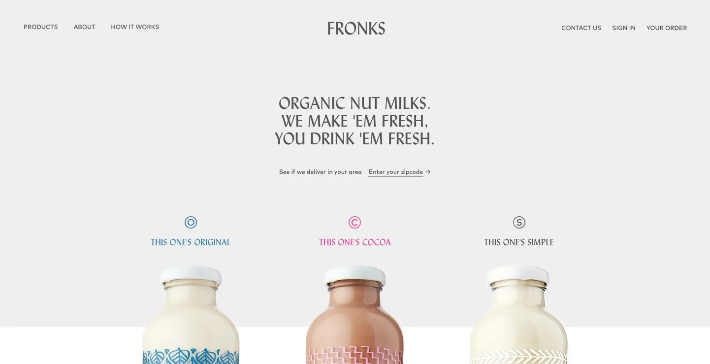
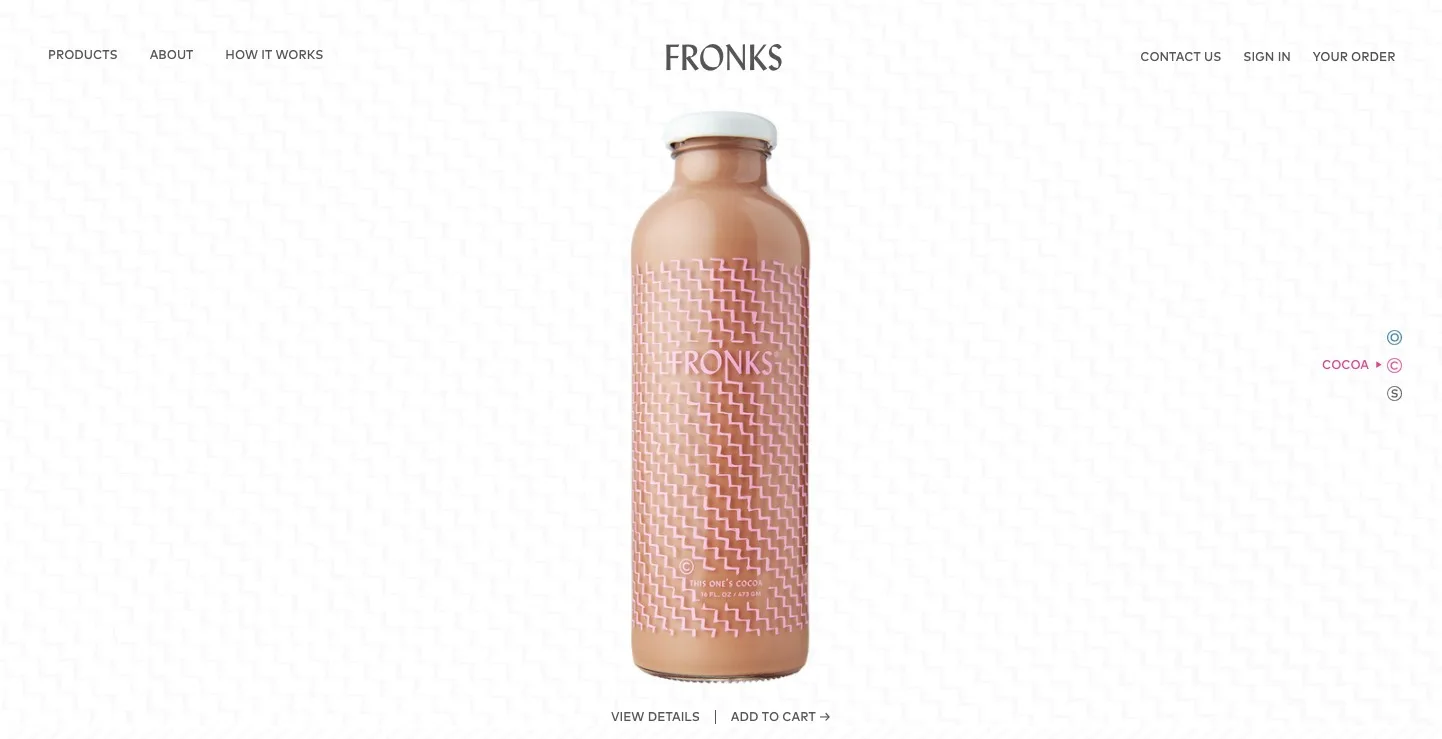
This often works very well for food sites. For example, on Fresh Fronks’ site, the only thing you can click on the homepage is a beautiful product image — that leads you to a beautiful product page. This is all a version of visual merchandising.
Wrapping Up
Visual merchandising is no longer a tool solely for brick-and-mortar stores. Online stores are more and more needing to offer immersive, engaging and sometimes personalised experiences for customers.
The goal is to move them from a landing page to a successful checkout page as quickly as possible –– all while engaging as many of their senses as a website can.

Tracey is the Director of Marketing at MarketerHire, the marketplace for fast-growth B2B and DTC brands looking for high-quality, pre-vetted freelance marketing talent. She is also the founder of Doris Sleep and was previously the Head of Marketing at Eterneva, both fast-growth DTC brands marketplaces like MarketerHire aim to help. Before that, she was the Global Editor-in-Chief at BigCommerce, where she launched the company’s first online conference (pre-pandemic, nonetheless!), wrote books on How to Sell on Amazon, and worked closely with both ecommerce entrepreneurs and executives at Fortune 1,000 companies to help them scale strategically and profitably. She is a fifth generation Texan, the granddaughter of a depression-era baby turned WWII fighter jet pilot turned self-made millionaire, and wifed up to the truest of heroes, a pediatric trauma nurse, who keeps any of Tracey’s own complaints about business, marketing, or just a seemingly lousy day in perspective.
